About the author : Diana

I'm a professional writer specializing in Web Development, Design, Developing Mobile Apps, Metaverse, NFTs, Blockchain and Cryptocurrencies.
Color Psychology has a huge impact on people, and the colors you choose in your digital marketing will have an impact on the decisions people make.
We’ll discuss the psychology of color in digital marketing, how it’s employed by major digital advertising companies and experts, and what methods you should explore for your own branding and graphics in this post. Let’s get this party started, shall we?
Is there really a thing as color psychology?
Yes! Colors elicit a wide range of responses from the brain’s emotion sensors, resulting in a wide range of results. A given hue, such as red or yellow, can call your attention towards something specific, yet other colors can be soothing, elicit a specific feeling, or bring back memories.
Color psychology is primarily concerned with how people feel about various colors as children, and how those feelings persist into adulthood. Firetrucks, for instance, are connected with red, whereas the sun or a school bus are associated with yellow. Color psychology is based on these kinds of connections.
It’s crucial to remember that different cultures have distinct connotations with colors, so what a hue signifies to one person could mean something completely different – for better or for worse – to someone from another culture. If you’re targeting an international audience, this is extremely crucial to remember.
When it comes to digital marketing, how does color psychology play a role?
When it comes to digital marketing color psychology, the colors you choose can make or break the message you’re attempting to deliver. It’s also about more than just specific hues. Consumers may be influenced by the color combinations you choose, as well as the amount of each color used.
To better grasp the psychology of colors in digital marketing, let’s begin with a quick color emotion guide:
- Elegance, finesse, and luxury are all attributes associated with the color black.
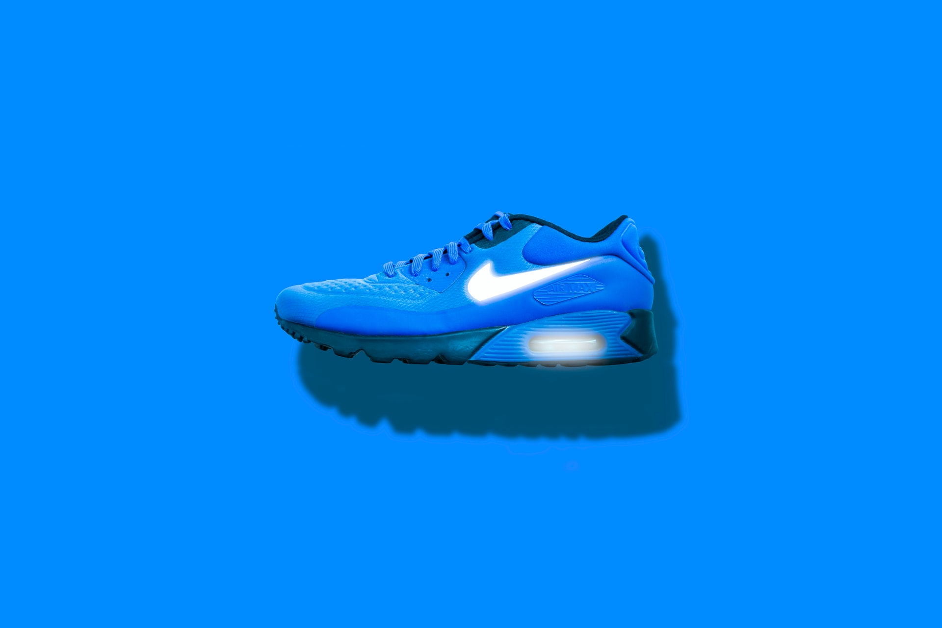
- Blue denotes freshness and airiness, as well as wisdom and leadership (depending on the shade)
- Balance, environment, harmony, environment, and rejuvenation are all words that come to mind when thinking of the color green.
- Happiness, motion, liveliness, and vitality are all associated with the color orange.
- Pink is a color associated with joy and optimism.
- Honesty, authority, religion, royalty, and well-being are all represented by the color purple.
- Endurance, power, and protection are all represented by the color red.
- Yellow represents creativity, vitality, optimism, fun, and vibrancy.
White is a popular hue in marketing because of the empty space it produces. It’s frequently employed as a decorative element or a backdrop for the remainder of the design. White (or a shade of white) can help the brain digest imagery that is too strong and overwhelming.
Aspects of Color
Even while various colors are frequently associated with a specific set of reactions, you must account for nuances.
While yellow is frequently associated with happiness, it can have a very different meaning depending on how it is used. It may become hostile rather than joyous when combined with a frightening image and large, bold writing. Rather of being pleasant, the yellow in this case is bold and powerful.
The color red is an additional example. Red can be uplifting and thrilling or negative and a warning depending on the picture and words it is combined with.
Combinations of Color
Each color is divided into two groups:
Blue, green, and violet are cool color combinations.
Orange, red, and yellow are all warming colors.
Clear skies, ice, nature, and water are symbolized by cool colors. They give the impression of space, cleanliness, and newness. Fire, heat, and sunsets are symbolized by warm hues. They make things feel cozier, more inviting, and more comfortable. Cool and warm hues are frequently combined in the same image to achieve a sense of balance.
Colors on the opposite sides of the color wheel are complementary cool and warm. Red, for instance, goes well with green, blue with orange, and yellow with violet. When employing complementary hues, make one take up 80% of the design while the other takes up only 20%. If the imagery were split 50-50, it would be more difficult to look at.
Marketing with Multi-Color Graphics
What happens if (almost) all of the hues are combined? You create a vibrant, youthful design that communicates your brand’s dynamism to customers.
A multicolored design, on the other hand, might be used to capture your eye. Although Visme isn’t as enjoyable as a cupcake company, they employ a variety of vibrant colors in their infographic to make it stand out.
What Makes Blue a Favorite Color for Designs and Logos?
Because blue has so many different associations, it’s a popular branding and marketing hue. Navy blue is connected with intelligence and leadership, whereas sky blue can create a pleasant, open-air impression. Children’s brands frequently employ pastel blue.
Blue is a popular color among corporate and technology brands because it is a soothing, non-polarizing hue that conveys intelligence, dependability, and trust. Soft blue hues are frequently used by health organizations because they are gentle and unobtrusive.
What Colors Should You Use for CTA Buttons?
Because red sticks out, is easy to see, and provides a sense of significance, many call-to-action (CTA) buttons are red. The “Get the ebook” CTA button is highlighted in red in the following example.
If cold and warm colors are being used in the identical graphic, the CTA button should be any one of them. The images are cold blue, whereas the CTA is warm red in the example above.
Final Remarks
The relationship between colors and emotions is unbreakable. Choosing the correct colors for your brand and marketing collateral is just as crucial as choosing the proper words, if not more so, because the brain sees and processes colors before it sees and processes language. Understanding color psychology advertising can assist you in selecting color schemes that will favorably represent your business and have the greatest impact on customers.
Seattle Advertising understands the effects of color psychology for digital marketing. Contact us today to find out how we can help your business.


